It might be presumptuous of me to tell other people how to fix aesthetic flaws in their bonsai. After all I am a novice. Like I have said before, bonsai is a living sculpture. Sculptures are art, and I know something about art. I will explain the fundamentals of art theory and relate them do bonsai aesthetics. Yes these are my opinions, you are welcome to disagree. I already stated that bonsai is art (http://bonsai-misadventures.blogspot.com/2016/03/bonsai-what-should-they-look-like.html). Now I will delve deeper.
I will focus on the following elements: line, shape, form, space, color, texture, and balance. So as not to bore you I will make separate posts for each element. We will begin with line. Lines are everywhere. Where dark and light meet you have a line. Where two colors meet you have a line. Trunks branches and leaves make lines. The silhouette of a tree makes a line. Lines are ever so important in art.
 |
| Lines guide the eye |
The lines in your bonsai will show the eyes what direction to move. The most interesting lines are the ones that vary in thickness and direction. Some people say that a bonsai needs a tapering trunk to suggest age. I say, maybe. However a tapering trunk is a line that varies in thickness and that my friends is very pleasing to the eye. A wide base and thin apex gives the illusion of a vanishing point. The more pronounced the further the perceived distance.
 |
| The trunk is a line of varying width |
Some lines are suggested. Like under and above a pad of foliage. I love white pine. The reason is that the needles are little lines. They vary in value (shade) and give the tree texture.
 |
| suggested lines under and above the foliage |
Lines tell the viewer what to feel. Vertical lines are rigid and stern. Horizontal lines are calm. Diagonal lines are action and tense.
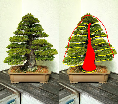
Take the formal upright style. Most of the lines are horizontal. In the center there is the main line which is vertical. These lines make the formal upright style seem traditional and comforting.
 |
| Vertical and horizontal lines |
I may offend some readers by saying that these horizontal and vertical lines are boring. What is keeping this style from making the trees look like topiary is the silhouette. The silhouette is composed of two suggested lines that are diagonal. Don't misunderstand me. Chokkan or formal upright is a very difficult style to make.
 |
| Suggested diagonal lines |
The windswept style can be very dynamic. I saw this chinese elm at the National Bonsai and Penjing Museum. I was awe stricken. Not only are the lines diagonal, but they move in one direction and then go the opposite way. There is a lot of movement for the eye to perceive.
 |
| Diagonal lines |
Lines, in road ways or art, they take us on a journey. Cheers.


No comments:
Post a Comment