Thursday, April 28, 2016

Bonsai from chain store home improvement centers

Many people put down big box stores or even regular plant nurseries as potential bonsai sources. I say, nay. Are these places the best place to pick up bonsai material? Of course they are not? Then why visit these places? The reason to visit them is because they are more convenient than a bonsai nursery. On a google maps I searched bonsai and got seven listings in the greater Los angeles area. I searched Home Depot and got 12 listings, then I searched Lowes and got 5 more listings. Just by my house there are two Home Depots and 1 Lowes with in a 4 mile radius. There are no bonsai nurseries within that radius, but there are three plant nurseries. Another reason to visit these places is the price. I have bought some trees with amazing trunks for six dollars and change. These trees at a bonsai nursery would easily sell for three to four times as much.

$6.95 for a fosemary with a great trunk
I think it very funny that people who badmouth trees bought at these stores highly prize wild collected trees. These wild collected trees are very difficult trees to work on because they grew however they wanted. It's much easier to work on nursery raised plants than wild plants.

This juniper i found at a regular nursery
There are some drawbacks. First, when we look for plants at a big box store we are looking for the jewell. We want the cream of the crop. It may take time to find a suitable plant. Heck we might not even find anything that week. The second negative is the plant selection. Most of these plants are for landscaping. What that means is that the same plants will be sold in your general area. On the flip side those plants are happy in the climate in which you live.


I have been to bonsai nurseries where they sell lantana for landscaping. These are beautiful 3 gallon plants. I walk to the bonsai section and the same lantana are in a bonsai pot. The new price is eighty five dollars. I am for cutting the middleman out if I can. I need to pinch those pennies.


If you have more time than money than you should look at the big box stores. So, what should you look at when buying plants? That will probably depend on your taste. I will tell you what I look for. First, the plant has to be healthy. There is no point in buying something that will die no matter how great the ramification is. The rest is arbitrary. I love to find plants with great trunks. It takes time to get a thick trunk. If the plant starts with a nice trunk you can invest time on other parts of the tree. Price is important to me. Plants that are around seven dollars are gold. Also, the plant species is important. To me some species are more desirable than others.
A dwarf olive with incredible potential bought at a home improvement center
When choosing a tree always remember that you will be reducing the size that you start with. If you want to end up with a twelve inch bonsai do not buy a thirteen inch tree. For a twelve inch bonsai you might have to start with twenty four inches. Sometimes none of the branches look like they will be helpful, but the trunk looks amazing. For that I lop all the branches off and start fresh. There is no point in keeping something bad just to try to fix it later. That's not to say that you should do that with all trees. If you are unsure of what to do leave it. As new branches and leaves grow you might get a clearer idea of what to do.
I cut all the branches from this pommegranet
Yes you can find material for bonsai at home improvement centers. You will have to look through some plants. I find that specific HIC have the best of one kind of tree. For example one might have great rosemary and another great boxwood. This probably has to do with suppliers in the area. Have a great time hunting for those trees. Cheers.  


Friday, April 22, 2016

Balance in bonsai composition, putting all the artistic elements together

O.k., we have gone over some of the elements in art. Now we have to put them all together in a balanced way. But, what does balance really mean? Everybody talks about balance. Balance seems to be important right?

Ill tell you this, you can have the best techniques for growing bonsai, you can have the best foliage pads, you can have a tree with no scars great taper and amazing ramification. Yet, if it is not balanced it will always look like something is not quite right.

So, what is this balance? Balance is a description of when elements in art are used to move the eye through an art piece. The eye has to move from one side to the other, top to the bottom in a nice steady space perhaps slowing down at the focal point.  

A concept of balance is weight. The elements of art have weight. The problem is that they don't all weigh the same. It's like gold, silver and aluminum (aluminium in Britain). They all have different weights. They are all metals, but a gold brick weighs much more than an aluminum brick. In art the general rule is that the more detail and the more contrast the more weight it has. The more weight something has the less you have to use of that element to achieve balance.

Below are two images. the first is a small dark hour glass and a large grey circle. They both carry about the same kind of visual weight. Even though the grey circle is bigger. the shape and color of the hour glass though small draw the eye to it. Since the circle is so big the eye is drawn to it also. However, because the gray is not a pronounced color it does not compete with the smaller hour glass. The second image is a lone red circle with texture. It is small and is balancing all that empty space on the left.


There are two main ways to achieve balance. The first is symmetrical balance. Symmetrical balance is when if you divide the art down the center top to bottom the left and the right side look like mirror images. If you split the following images down the middle they will look like mirror images. They are balanced symmetrically.


goyo matsu


Easy right? To bad most bonsai are not symmetrical. Most bonsai are asymmetrical. The letter A in asymmetrical means without. So an asymmetrical bonsai is a bonsai lacking symmetry, If you split those in half they do not look like mirror images. However, asymmetry makes for much more interesting bonsai.

Remember the picture of the hourglass and the picture with the red dot on one side up above? Those pictures are in asymmetrical balance. They use different elements of varying weight to balance the picture.

The key to asymmetrical balance is using art elements. Because we are working with trees and living sculptures it is easier to achieve balance than other medium. The beginning point for bonsai is the base. That is the place where the trunk and the soil meet.

Lets look at this chinese elm from the National Bonsai and Penjing Museum. This is most definitely an example of asymmetrical balance. If you slice this bonsai in half from top to bottom they would not look like mirror images.


asymmetrical balance

Ryan Neil says that the human eye is first attracted to the green foliage of trees. This tree does not have any though. What does your eye want to look at?  Well, mine goes to the fine ramification, but then it has no line to follow. Then my eye wanders to the base of the trunk. The base is big, it has an awkward look to it and we can follow the trunk up the tree. This is a focal point.


From the base we follow the diagonal tapering line up the tree. The trunk carries a lot of weight. It divides the tree, and is the foundation of the trees form. The line that the trunk makes is a diagonal which suggests motion. It also is a curving line. That makes the tree that much more interesting.

art elements, line

The trunk pulls our attention to the right. To bring our attention back to the left the artist used the branches. The branches have all that fine ramification, and the pads are triangular shaped. Since the branches move to the left they are good counter weight to the trunk. There is a branch pulling to the right. It is helping the tree keep its form and stay balanced.

Art element, lines

. In the world of art odd numbers rule. Things look best in odd numbers. There are five foliage pads. These pads alternate sides on the trunk. The pads are triangular shaped. All of this is great Rhythm.   

art element, form, rhythm, balance

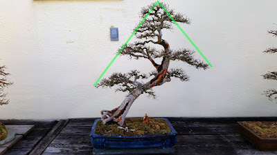
Finally, we have two suggested lines. These lines are the silhouette of the tree. They suggest a vanishing point. The large taper suggest a long distance.

asymmetrical balance

The many elements to art can make a tree look amazing. The key is in making sure that they are all working together. There should be a sense of harmony. If something is not looking right then the tree is probably not balanced. Covering a branch with a white rag helps visualize the tree without that branch. You can use that technique on any part of the tree. That way you will be able to find whatever is throwing the balance off. Cheers.


Thursday, April 21, 2016

Artistic elements in bonsai, the Focal point

Focal points are wonderful tools. They grab the attention of the viewer. In trees focal points for the most part are in Mr. Ryan Neil’s words special features. Special features are those parts of a tree that you want to highlight. Some trees have amazing flowers. Special features can be jin and shari. Also, fruits and leaves can be special features. Focal points can be the nebari (roots on the soil surface), or the way the trunk twists. Think to yourself what is the most interesting part of the tree?

Since your focal point grabs attention quickly it carries a lot of weight. On a post about balance I will touch on focal point in the overall picture. Cheers.


the rock is an amazing focal point
All that Shari brings the eyes right to the trunk
You can't help looking at the tick twisted part of the trunk
ficus microcarpa
The aerial roots are a good focal points

Is there a focal point here?

Wednesday, April 20, 2016

Artistic aesthetic elements in bonsai, Space

It's everywhere unless we are taking it up. Space is another element in art.  There are two parts to space. They are positive space and negative space. Positive space is the space that the tree takes up. This includes trunk, branches, and foliage. Negative space is the space in between the positive space. In other words the empty space.


Understanding negative space is critical to good bonsai design. Even though negative space is empty space it plays an important role in where we place the parts of a tree.


Look athe the branches from left to right. It is filled with negative space. However, some spaces are bigger than others. The left side the negative spaces are more and they are smaller. The right side has bigger negative space. As your eyes move along the tree it will tend to pause at those bigger spaces. I don’t really want that to happen with this tree. So I will have to break up the negative space.


Can you see the difference?


There is also negative space that surrounds the tree. I personally prefer when the negative space surrounding a branch touches the trunk. That is just my preference. Here are two distinct ways to use negative space.  


Space, its positive or its negative. Use negative space to support your positive space. Lots of negative space around an object makes it look alone. Less negative space creates more tension. Cheers.

Tuesday, April 19, 2016

Artistic elements in bonsai... Color Theory (it is still about bonsai)

Color in bonsai is pretty much straight forward. In bonsai earth tones and greens dominate. Earth tones are the colors you see in dirt. This could be reds, browns, blacks greys, whites and even some yellows. Bonsai may have other color due to flowers, and fruits. Some trees new growth are red and later turns green. Add to that the pots the trees are in and you have a lot of color. So how do we know what color pot to use?


What part of the tree do you want to emphasise? Is it a red berry? Orange leaves in the autumn (called fall in the U.S.)? Is it the bark, leaves, deadwood? Choose what you want to emphasize? Once you decide what you want to emphasize then you will have to apply color theory.


Color theory may seem somewhat difficult to understand but i'll try to make it painless. Every color has a complimentary color. Complimentary is just that, the two color together make each other look better. They compliment one another.

Finding the compliment of a color is easy. All you need is a color wheel. First, start with the primary colors which are red, blue, and yellow. All the rest of the colors come from a mix of these three colors.  


Primary colors

If red and yellow had a baby it would be orange.

If red and blue had a baby it would be violet.


If yellow and blue had a baby it would be green.


The color wheel


All these children colors are called secondary colors. Now we can get to more intense color theory. It just so happens that complementary colors are each other's negatives. If you are good with the concepts up to now keep reading if not skip the next paragraph.


Everybody who was born from 1985 back still remembers film cameras. Remember looking at the developed film? That was called a negative. Remember how the colors were all weird? They were not flesh tones, but seemed greenish. The darks in the real world were light in the negative and vice versa. That film was called a negative because it had captured the negative (opposite) colors. Are you still with me? To make it easier you can call them opposite colors instead of negative, but on the exam at the end of the post please call it a negative color.

The compliment of red is green. The compliment of orange is blue. The compliment of yellow is violet. Do you see a pattern emerging? Do you see how sport teams use complimentary colors in their uniforms?


Black and white are each others compliment. However, they are not colors. Black and white are values, they are light and the absence of light.

So, How can we use all this information? Well, like i said before choose something that you want to emphasise. Do you love how your green maples leaves turn orange in the autumn? If you do put it in a blue pot.

Pick your favorite out of the tree pictures.


Most people are going to pick the blue pot and now you know the reason why. Lets try one more. Let's do pink blossoms.


Again, most will pick the green pot to match up with the pink blossoms. Pink is a lighter red, and red and green are complementary.

Ok, last part of this color theory. Analogous colors. Analogous colors are colors in the same family. These would be red, yellow, orange, or red, violet, blue. Also, blue, green, yellow.  


There are color wheels out there in the interworld that break things down more, but this is a great beginning. The more you mix colors the more complementary combinations. 

One more thing to keep in mind is that you might want to mix up the value. You might not want to keep the color intense and bright. Play around with darks and lights. This will give an extra layer of thoughtfulness. Cheers.  


Monday, April 18, 2016

Artistic Aesthetic elements cont..., Shapes and forms

Shapes are two dimensional and geometric. When you draw a circle, square, or triangle you are drawing a shape. Forms are three dimensional and geometric. These include cylinders, pyramids, and cones. I would say that the most prevailing shape in bonsai is conical.


conical


Semi spherical
Spherical form


Besides the obvious silhouette made by a form they are important in that they can add to motion. In sculpting rhythm is important. Adding forms to sculpture gives rhythm. Repetition of shapes in varying sizes creates rhythm.


The trunk and foliage are two different cones

Rhythmic design

Shapes and forms are easier to understand than some other elements. The key is to use them to guide the eye. Cheers.


Saturday, April 16, 2016

Artistic aesthetic elements in bonsai, or making bonsai pretty

It might be presumptuous of me to tell other people how to fix aesthetic flaws in their bonsai. After all I am a novice. Like I have said before, bonsai is a living sculpture. Sculptures are art, and I know something about art. I will explain the fundamentals of art theory and relate them do bonsai aesthetics. Yes these are my opinions, you are welcome to disagree. I already stated that bonsai is art (http://bonsai-misadventures.blogspot.com/2016/03/bonsai-what-should-they-look-like.html). Now I will delve deeper.


I will focus on the following elements: line, shape, form, space, color, texture, and balance. So as not to bore you I will make separate posts for each element. We will begin with line. Lines are everywhere. Where dark and light meet you have a line. Where two colors meet you have a line. Trunks branches and leaves make lines. The silhouette of a tree makes a line. Lines are ever so important in art.  

Chokkan
Lines guide the eye

The lines in your bonsai will show the eyes what direction to move. The most interesting lines are the ones that vary in thickness and direction. Some people say that a bonsai needs a tapering trunk to suggest age. I say, maybe. However a tapering trunk is a line that varies in thickness and that my friends is very pleasing to the eye. A wide base and thin apex gives the illusion of a vanishing point. The more pronounced the further the perceived distance.

The trunk is a line of varying width
Some lines are suggested. Like under and above a pad of foliage. I love white pine. The reason is that the needles are little lines. They vary in value (shade) and give the tree texture.


Pinus parviflora
suggested lines under and above the foliage
Lines tell the viewer what to feel. Vertical lines are rigid and stern. Horizontal lines are calm. Diagonal lines are action and tense. 


Take the formal upright style. Most of the lines are horizontal. In the center there is the main line which is vertical. These lines make the formal upright style seem traditional and comforting.  
Vertical and horizontal lines
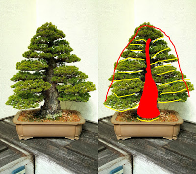
I may offend some readers by saying that these horizontal and vertical lines are boring. What is keeping this style from making the trees look like topiary is the silhouette. The silhouette is composed of two suggested lines that are diagonal. Don't misunderstand me. Chokkan or formal upright is a very difficult style to make.
Suggested diagonal lines
The windswept style can be very dynamic. I saw this chinese elm at the National Bonsai and Penjing Museum. I was awe stricken. Not only are the lines diagonal, but they move in one direction and then go the opposite way. There is a lot of movement for the eye to perceive.

Diagonal lines

Lines, in road ways or art, they take us on a journey. Cheers.