O.k., we have gone over some of the elements in art. Now we have to put them all together in a balanced way. But, what does balance really mean? Everybody talks about balance. Balance seems to be important right?
Ill tell you this, you can have the best techniques for growing bonsai, you can have the best foliage pads, you can have a tree with no scars great taper and amazing ramification. Yet, if it is not balanced it will always look like something is not quite right.
So, what is this balance? Balance is a description of when elements in art are used to move the eye through an art piece. The eye has to move from one side to the other, top to the bottom in a nice steady space perhaps slowing down at the focal point.
A concept of balance is weight. The elements of art have weight. The problem is that they don't all weigh the same. It's like gold, silver and aluminum (aluminium in Britain). They all have different weights. They are all metals, but a gold brick weighs much more than an aluminum brick. In art the general rule is that the more detail and the more contrast the more weight it has. The more weight something has the less you have to use of that element to achieve balance.
Below are two images. the first is a small dark hour glass and a large grey circle. They both carry about the same kind of visual weight. Even though the grey circle is bigger. the shape and color of the hour glass though small draw the eye to it. Since the circle is so big the eye is drawn to it also. However, because the gray is not a pronounced color it does not compete with the smaller hour glass. The second image is a lone red circle with texture. It is small and is balancing all that empty space on the left.
There are two main ways to achieve balance. The first is symmetrical balance. Symmetrical balance is when if you divide the art down the center top to bottom the left and the right side look like mirror images. If you split the following images down the middle they will look like mirror images. They are balanced symmetrically.
Easy right? To bad most bonsai are not symmetrical. Most bonsai are asymmetrical. The letter A in asymmetrical means without. So an asymmetrical bonsai is a bonsai lacking symmetry, If you split those in half they do not look like mirror images. However, asymmetry makes for much more interesting bonsai.
Remember the picture of the hourglass and the picture with the red dot on one side up above? Those pictures are in asymmetrical balance. They use different elements of varying weight to balance the picture.
The key to asymmetrical balance is using art elements. Because we are working with trees and living sculptures it is easier to achieve balance than other medium. The beginning point for bonsai is the base. That is the place where the trunk and the soil meet.
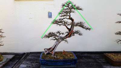
Lets look at this chinese elm from the National Bonsai and Penjing Museum. This is most definitely an example of asymmetrical balance. If you slice this bonsai in half from top to bottom they would not look like mirror images.
Ryan Neil says that the human eye is first attracted to the green foliage of trees. This tree does not have any though. What does your eye want to look at? Well, mine goes to the fine ramification, but then it has no line to follow. Then my eye wanders to the base of the trunk. The base is big, it has an awkward look to it and we can follow the trunk up the tree. This is a focal point.
From the base we follow the diagonal tapering line up the tree. The trunk carries a lot of weight. It divides the tree, and is the foundation of the trees form. The line that the trunk makes is a diagonal which suggests motion. It also is a curving line. That makes the tree that much more interesting.
The trunk pulls our attention to the right. To bring our attention back to the left the artist used the branches. The branches have all that fine ramification, and the pads are triangular shaped. Since the branches move to the left they are good counter weight to the trunk. There is a branch pulling to the right. It is helping the tree keep its form and stay balanced.
. In the world of art odd numbers rule. Things look best in odd numbers. There are five foliage pads. These pads alternate sides on the trunk. The pads are triangular shaped. All of this is great Rhythm.
Finally, we have two suggested lines. These lines are the silhouette of the tree. They suggest a vanishing point. The large taper suggest a long distance.
The many elements to art can make a tree look amazing. The key is in making sure that they are all working together. There should be a sense of harmony. If something is not looking right then the tree is probably not balanced. Covering a branch with a white rag helps visualize the tree without that branch. You can use that technique on any part of the tree. That way you will be able to find whatever is throwing the balance off. Cheers.


No comments:
Post a Comment